
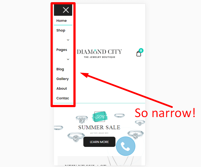
Sometimes our clients encounter an issue when the Max Mega Menu dropdown looks too narrow on mobile. Among others, this can be observed in our Diamond City theme.
The issue looks like this:
So how do we defeat this dragon? Luckily, there is an easy fix!
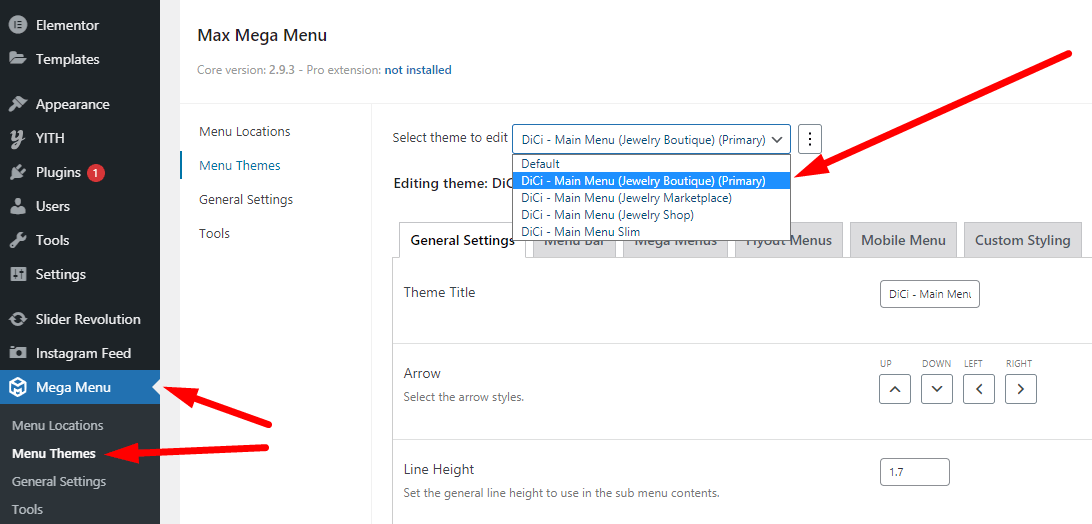
In your WordPress dashboard go to Mega Menu -> Menu Themes -> select the relevant theme that is applied to the Primary menu location on your site:
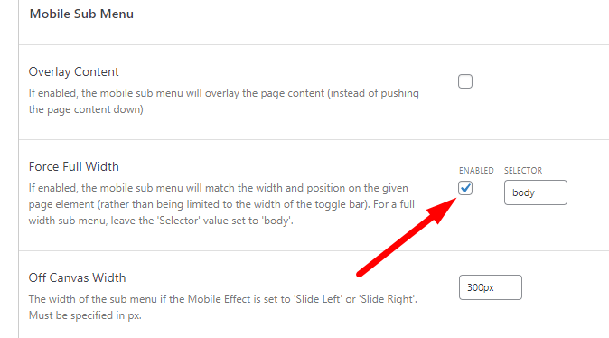
Once the correct primary menu is selected, then go to the Mobile Menu tab, scroll down a bit, and check the Force Full Width checkbox, save changes:
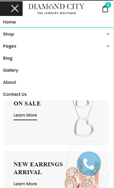
That’s all! Now your Max Mega Menu is no longer narrow on mobile devices! Hooray!
What if it’s not working!?
Well, there are a few things that can go wrong here.
First of all, you need to make sure that you are working with the correct menu theme. Typically, you’ll see several menu themes in your Max Mega Menu plugin options. Only one of them is applied to your Primary menu and works on your site. The rest of the themes do not work on your site and there is no point in editing them.
So, here’s an example of a theme we should not work on: Screenshot
Here’s the theme we should work on: Screenshot
If this solution still didn’t work for you, or if you have any other questions – please don’t hesitate to create a ticket at https://themeszone.freshdesk.com