
Here’s a very simple solution to the Revolution Slider not working on mobile devices problem. Usually, Slider Revolution is simply not showing on small devices, and all you need to do is to show it. We are going to demonstrate this on an example of Chromium theme and it’s slider.
In your WordPress dashboard, go to the Revolution Slider menu:
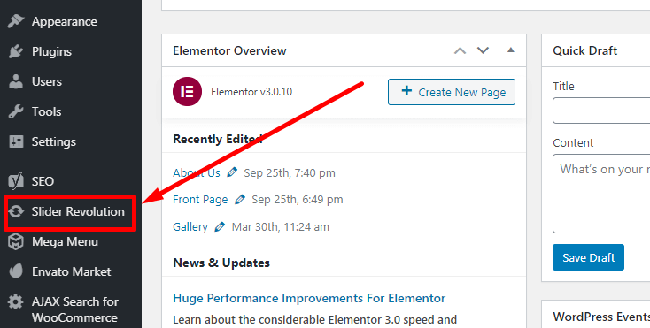
Then you need to select the correct slider, in case if you have several of them. If you install the demo on a clean WordPress install, you will have one demo slider by default. Hover your mouse cursor over the slider that’s not showing on mobile and press the pen icon to access the slider’s settings panel:
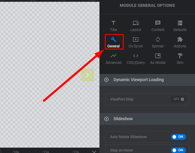
Then go to General slider settings at the right side of the screen:

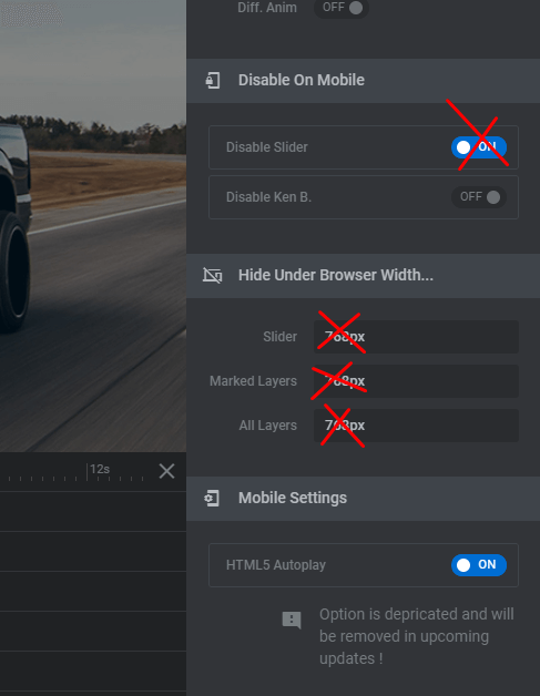
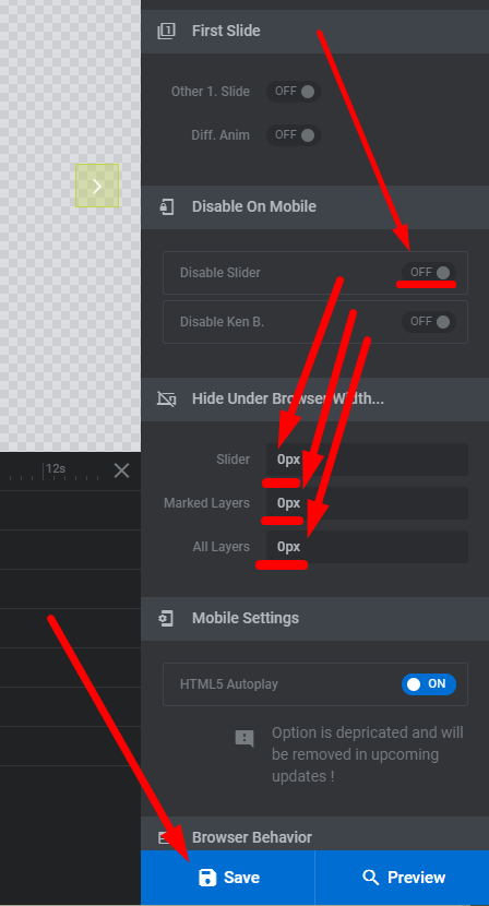
After that, you need to put the “Disable Slider on Mobile” switcher to “off” position and make sure that “Hider Slider Under Width: parameters are all set to zeroes. Don’t forget to save changes:

That’s it, the slider is now should be showing on mobile devices. Don’t forget to reload the front page to see the changes.
For Handy theme, the procedure is slightly different.
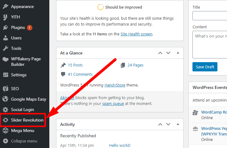
First of all, you need to login to your WordPress dashboard. Then you need to go to Slider Revolution:
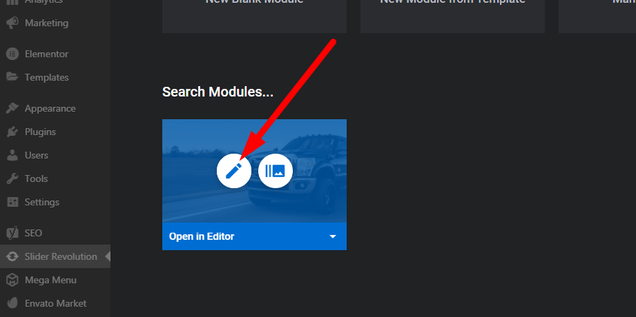
After that, you need to select the slider you need, in case if you have several sliders. Hover your mouse cursor over the slider that’s not showing on mobile and press the edit icon to access the slider’s settings panel:

There go to General settings (you can click on images to open their enlarged versions in a new tab):
After that, you need to make sure the “Disable Slider on Mobile” switcher is set to “off” and make sure that “Hider Slider Under Width: parameters are all set to zeroes. Don’t forget to save changes:
Then go to the page where your slider is located and reload it. The slider should now be showing on mobile devices as well. The above measures should be sufficient for most cases. However, this may not be enough for cases like ours.
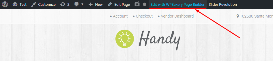
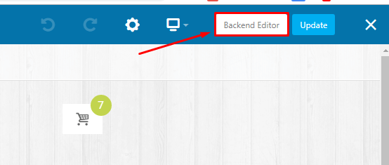
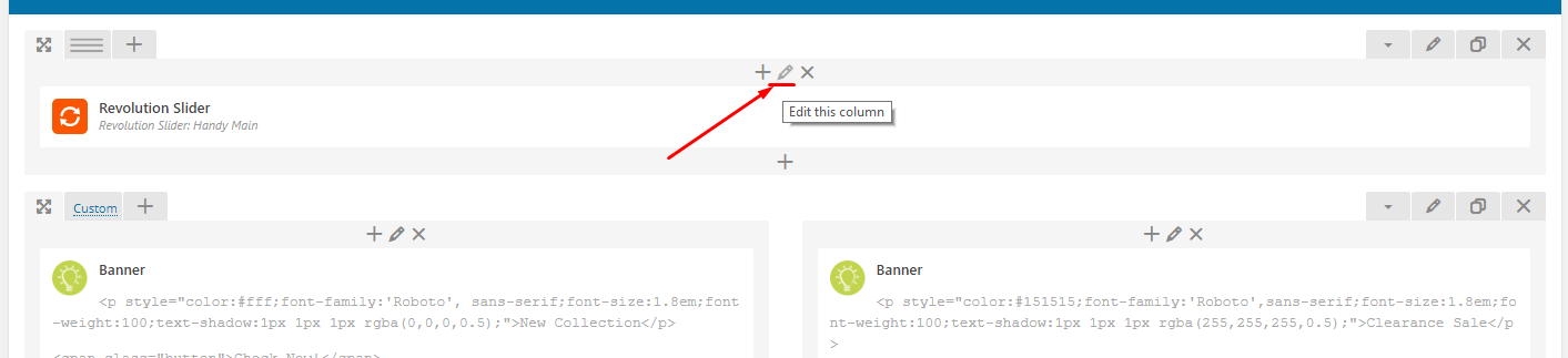
You also need to go to edit the page on which the slider is located in WP Bakery Page Builder, switch to the backend editor:
Then you need to find the column in which Revolution Slider which is not working on mobile is placed and press the edit column button:
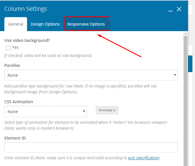
Then switch to the “Responsive Options” tab:
Inside the “Responsive Options” tab, uncheck all the “Hide on device?”:
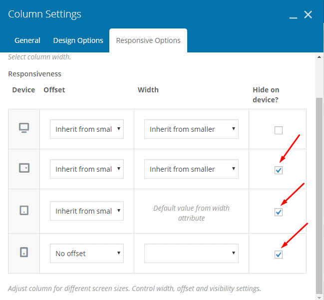
After that save changes to the column settings and update the page. Now your Handy slider should be visible on mobile devices.
You can also learn more about making your Revolution Slider responsive in this article.